Rebuilding digital experiences for 500+ hackers at UofTHacks
- Role
- Product Designer
- Timeline
- March 2026 - Present
- Skills
- Product DesignDesign SystemsPrototyping
- Tools
- FigmaClaude Code
Overview
Designing digital experiences for 500+ hackers
UofTHacks is an annual hackathon organized by students at the University of Toronto. It brings over 500+ developers, designers, and entrepreneurs together for a 36-hour in-person event.
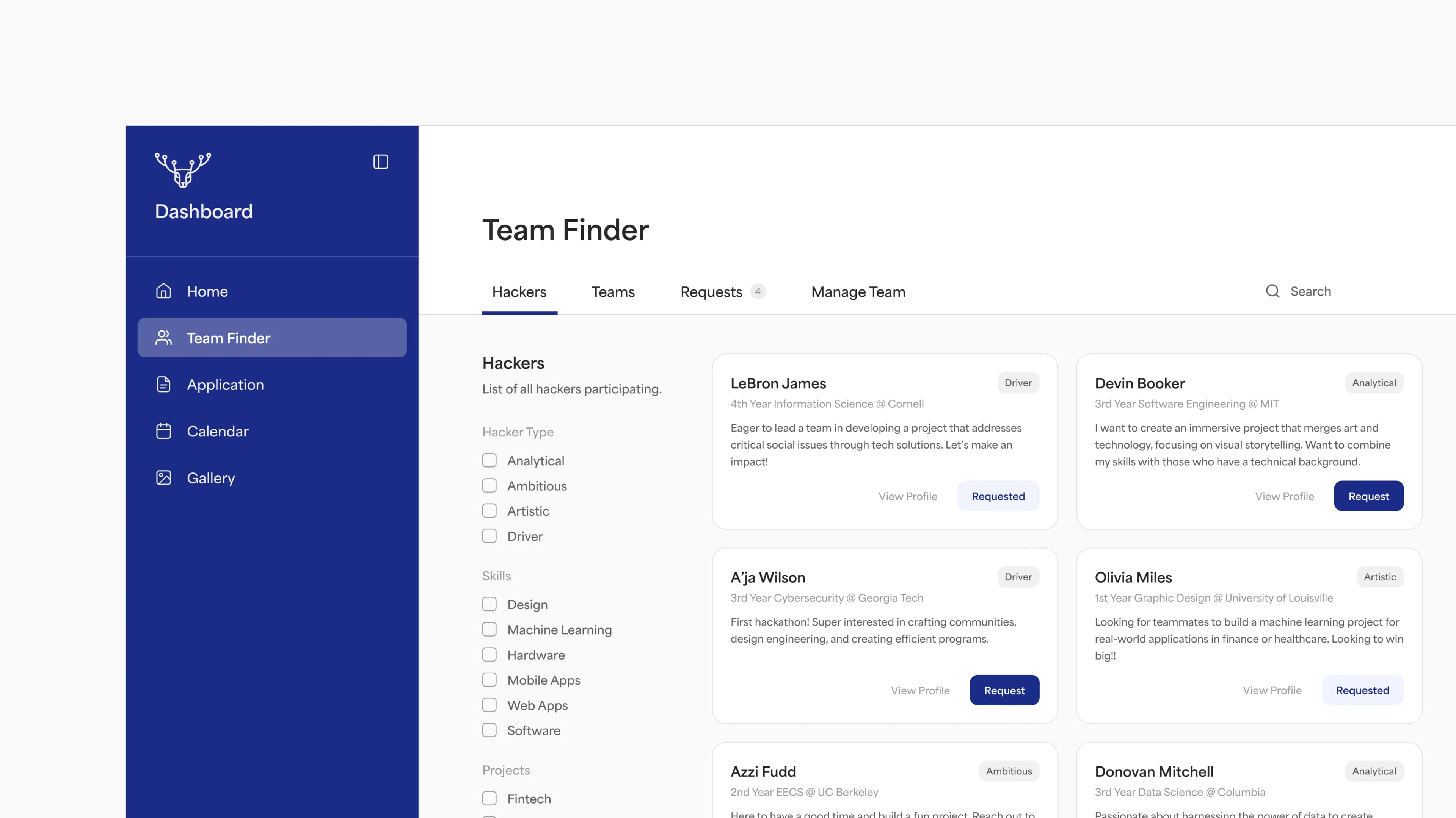
As a Product Designer, I worked on shaping various experiences within our new hacker portal, such as the Login Flow, Hacker Application and Team Finder. This case study focuses on the Team Finder tool, which hackers use to form teams with others.
Problem Framing
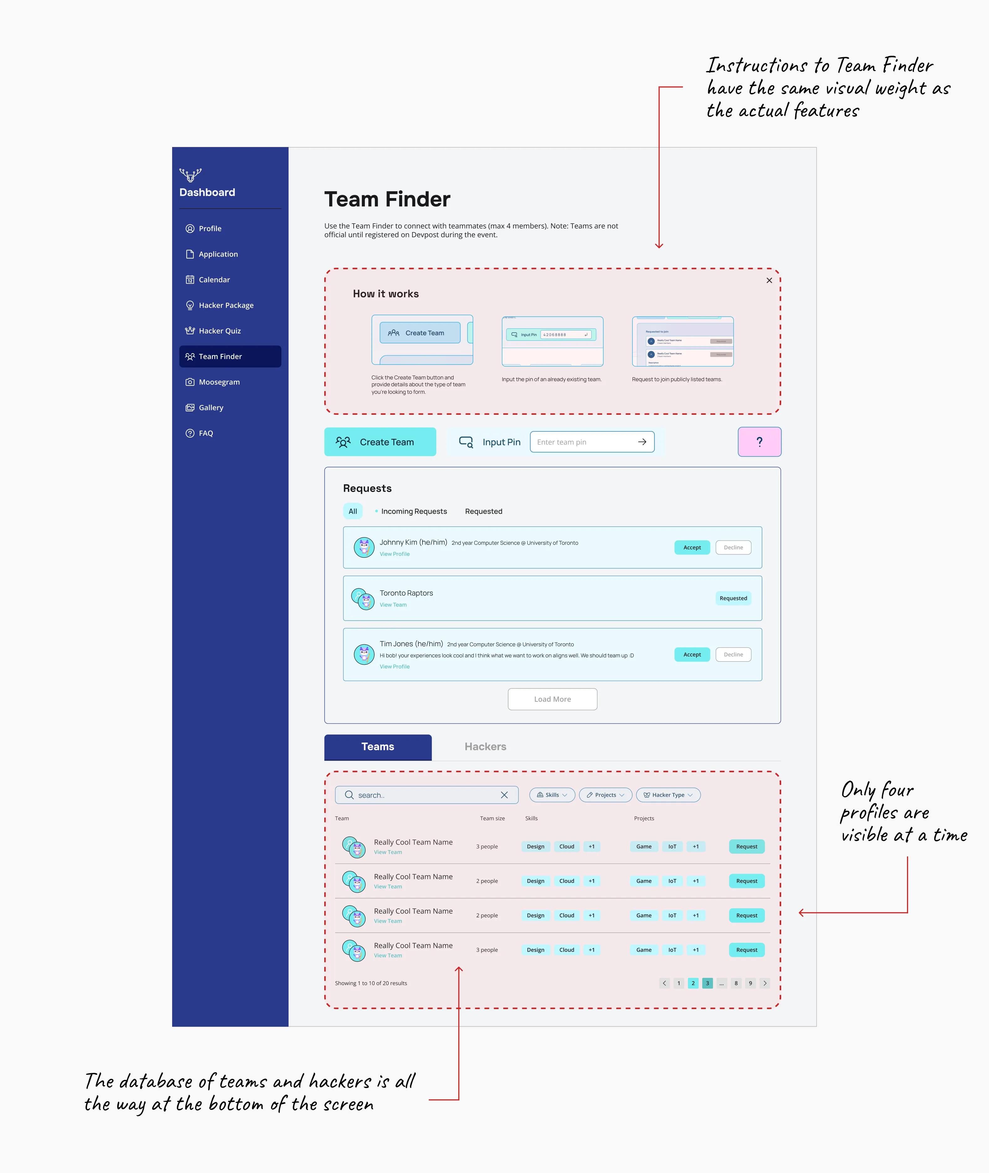
The existing interface was cluttered, with no clear focus
Team Finder did not have a clear primary action for hackers to engage with due to the lack of visual weight and the odd placement of certain features. The abundance of containers also created unnecessary visual noise and added to the lack of clear focus.
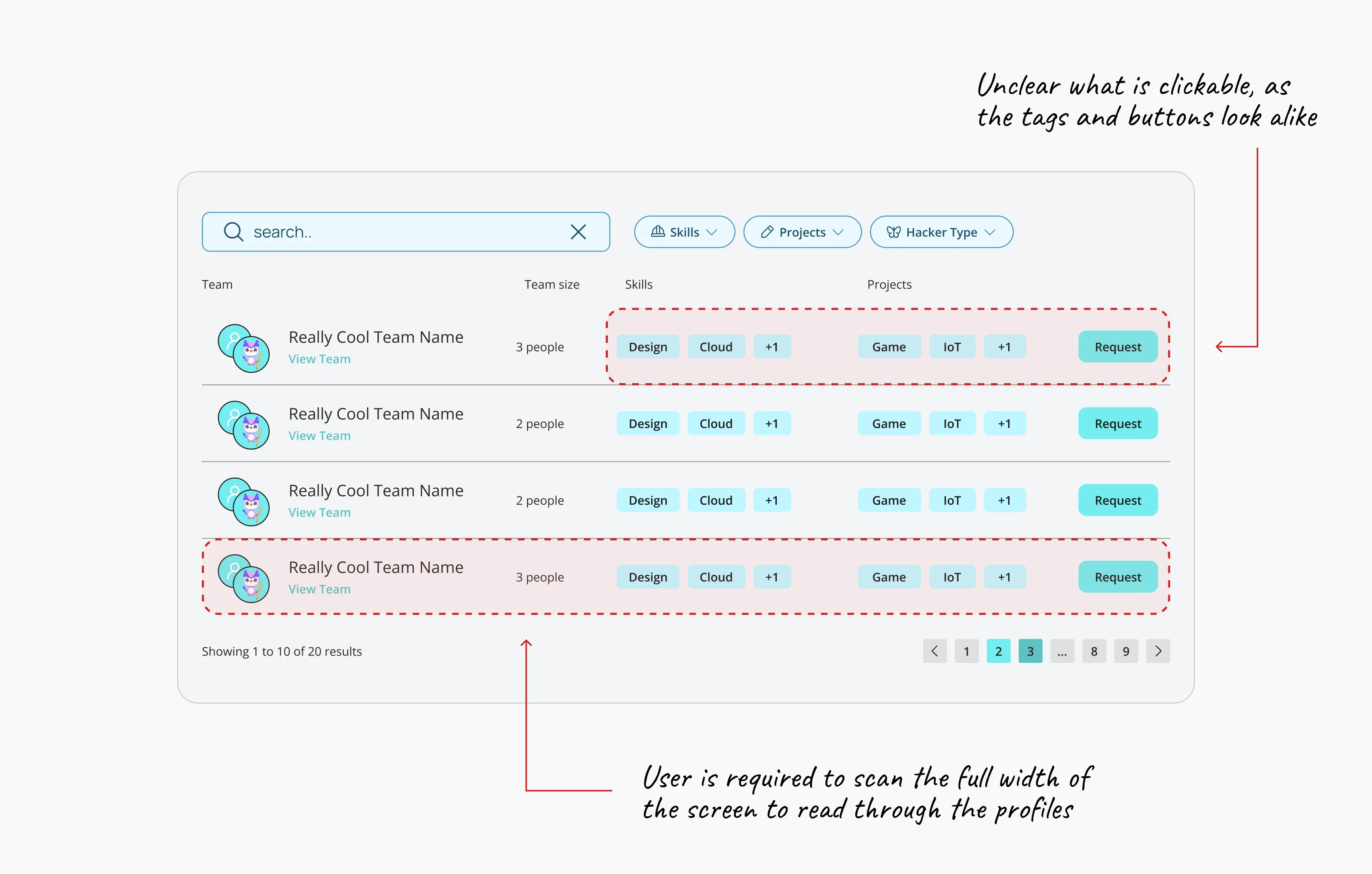
Profiles were difficult to scan
Profiles were arranged in rows with no clear visual hierarchy, making it hard for hackers to find what they need.
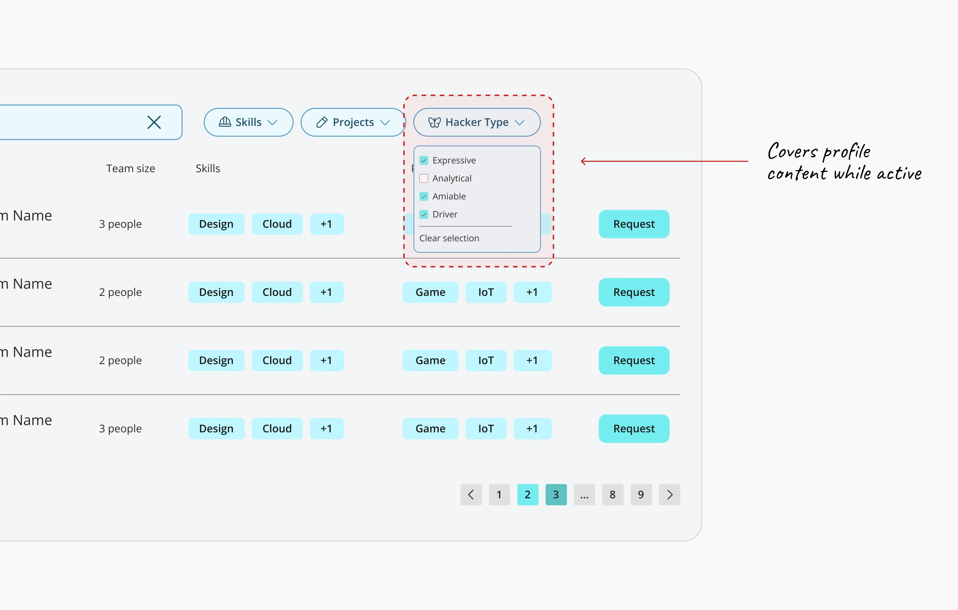
Hidden and disruptive filters
Filters were hidden behind dropdowns, adding friction when hackers tried to use them. Once open, they also blocked some of the profile content underneath.
User Goals & Features
Quick to scan
Make the profiles easy to scan, so users can effortlessly move through the database.
Search and filter with intent
Give users the tools to narrow down the database, since most users search with a specific profile in mind.
Solution Highlight
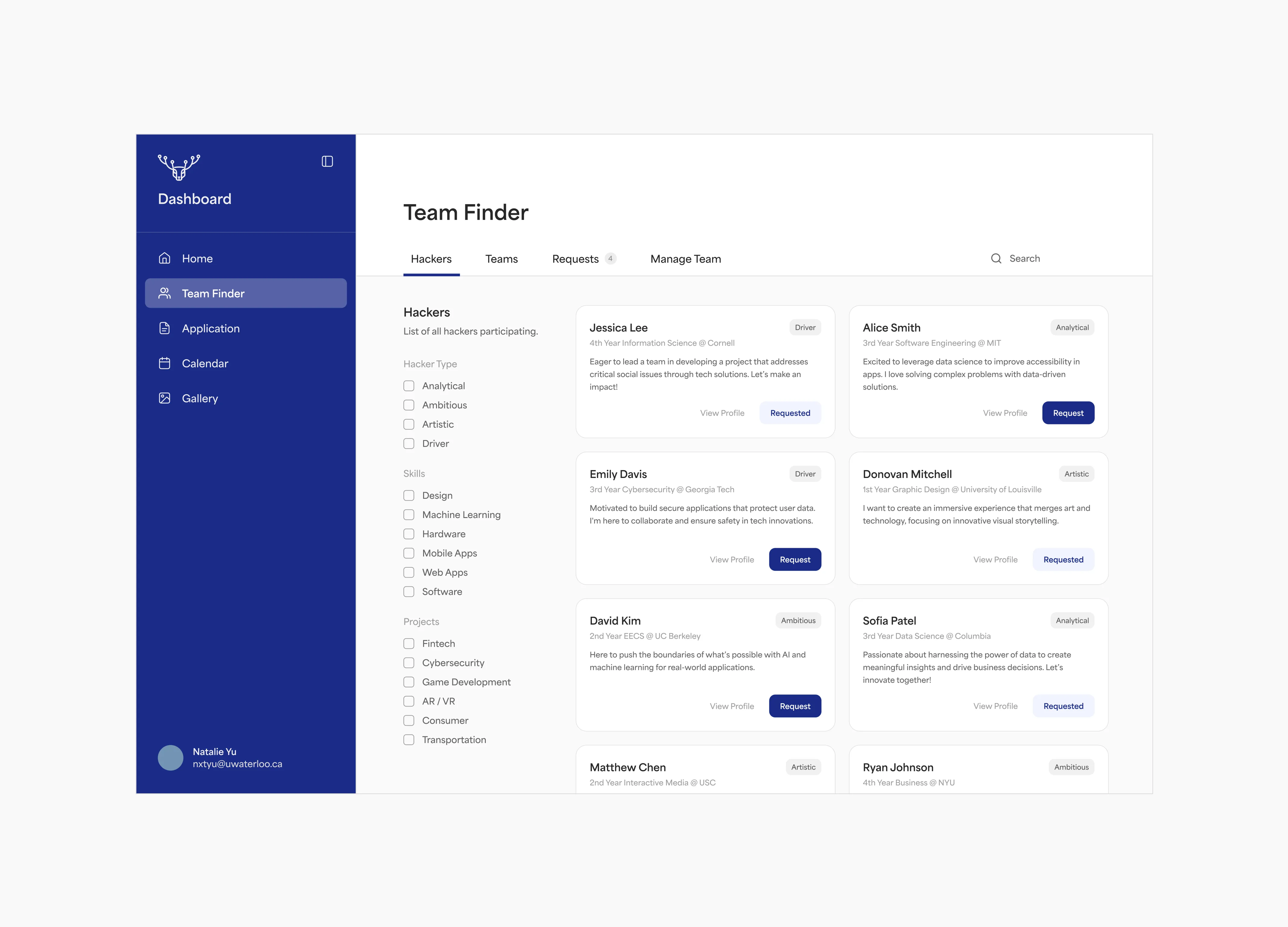
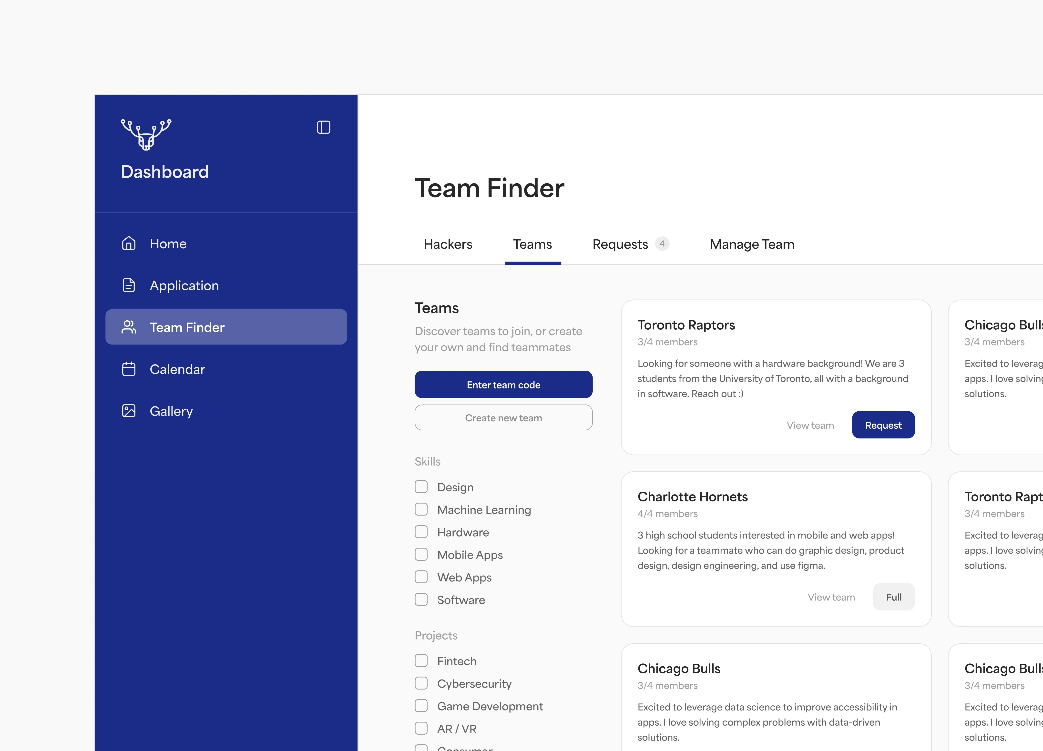
Reducing cognitive load with in-page tabs
Each section is divided into its own tab, creating more screen space to display content and letting the user focus on one task at a time.
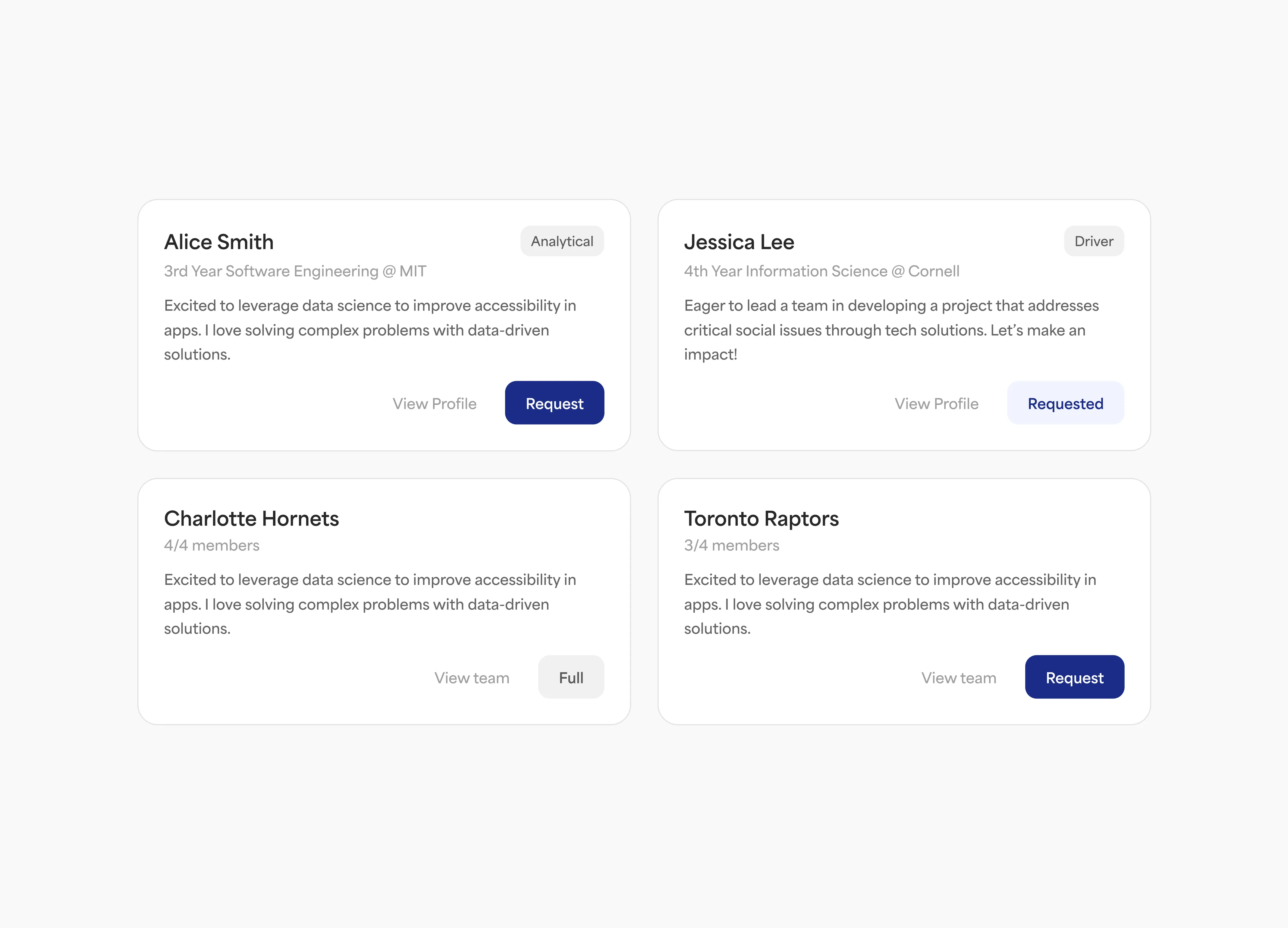
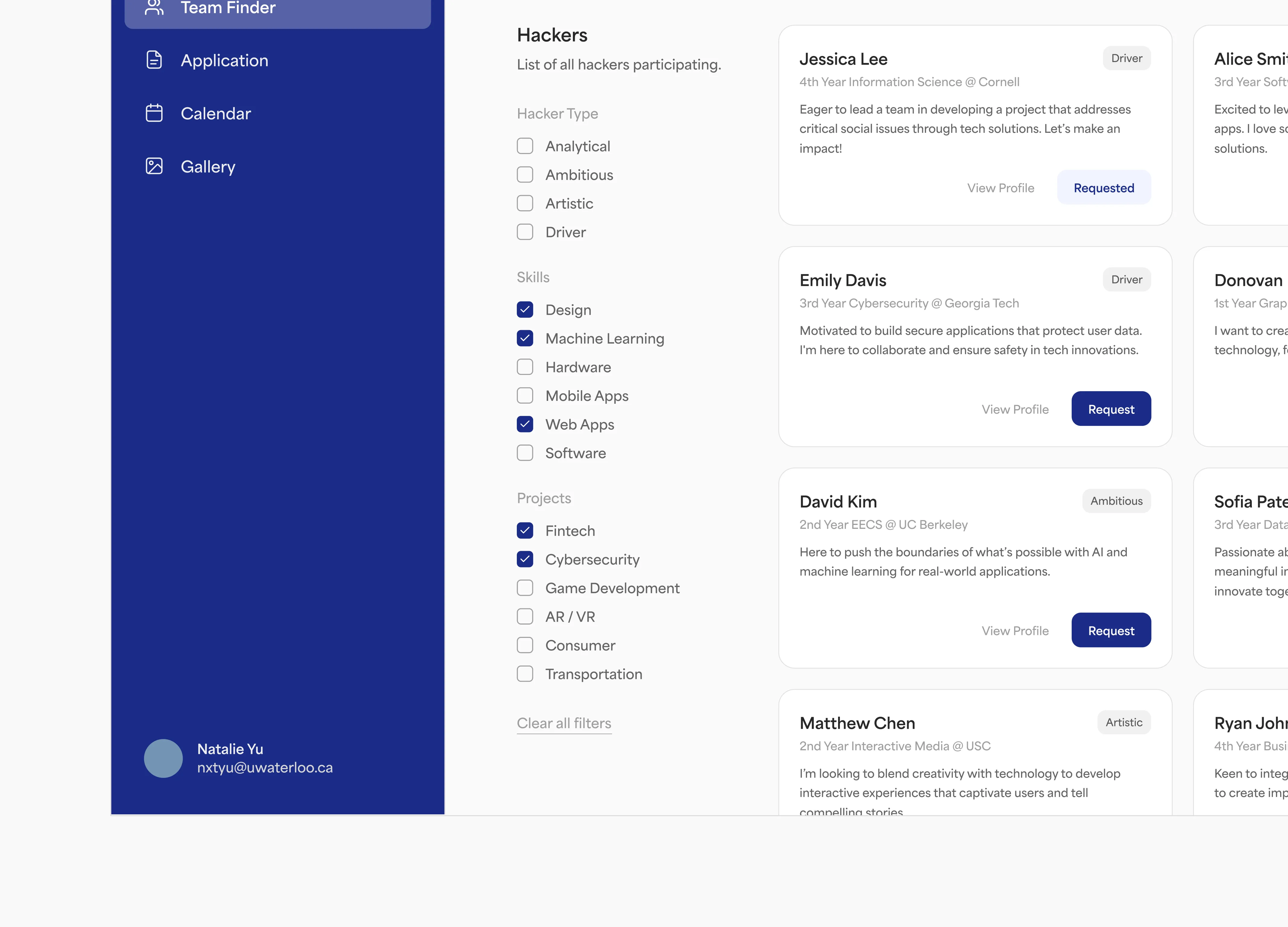
Displaying profiles with cards
Displayed the hackers in a card-based layout with stronger visual hierarchy to allow users to easily scan through each profile. Clicking the profile opens up a modal with further information so users can see additional information without overloading the main interface.
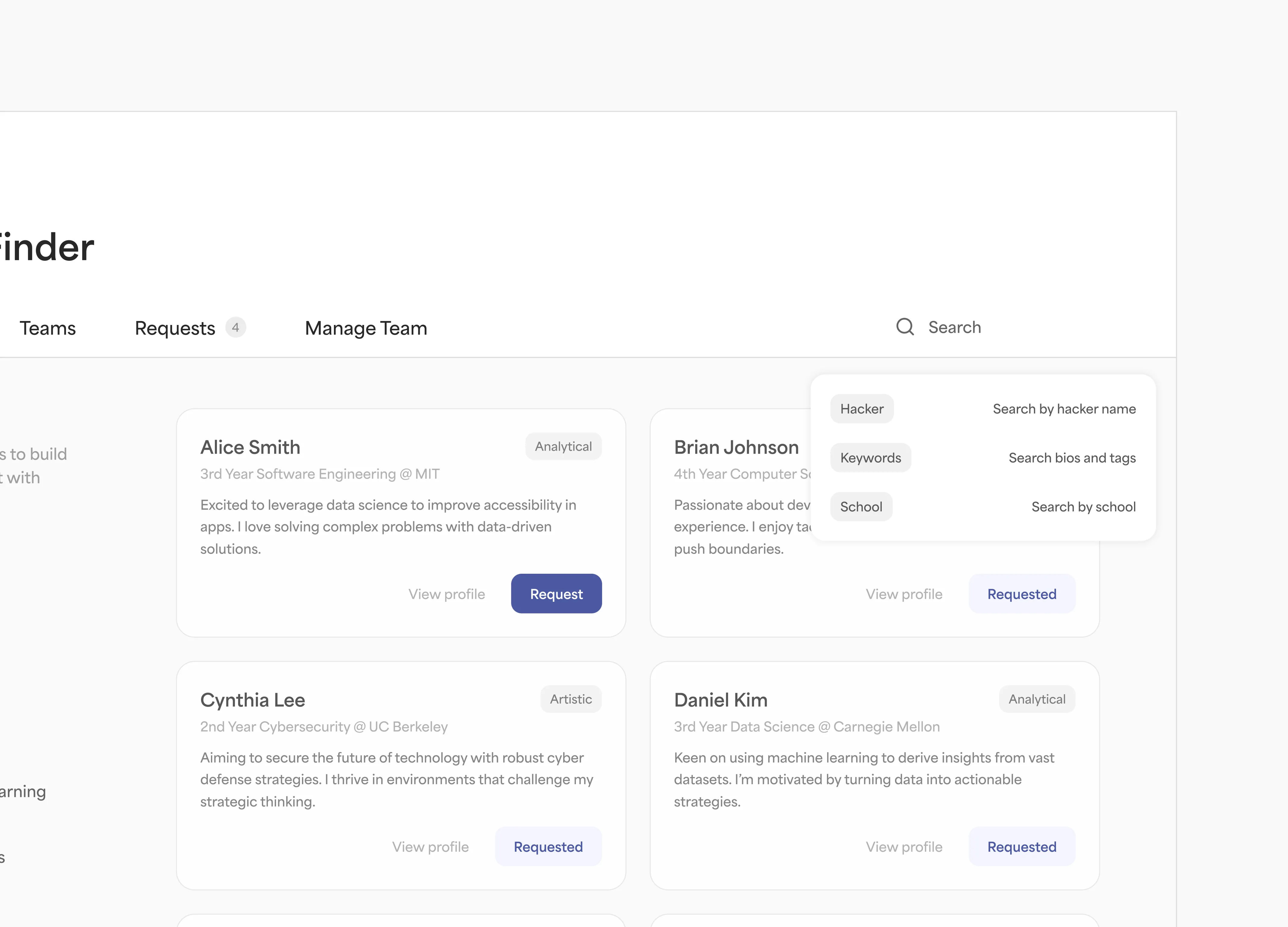
Making search and filter easier to reach for
Search suggestions show users what is searchable while filters stay fixed on the side for easy access.
Reflections
My takeaways
Think about the tool as a whole. The main goal of Team Finder was helping hackers form teams, but the card layout was not the only screen. Every exploration and dashboard layout had to work across the rest of the tool, including screens for managing requests and team settings.
The value of prototyping with code. For my early explorations, I designed straight inside Claude Code to feel out the interactions and how the tool worked as a whole. AI tools have enabled such rapid iteration that low fidelity is not really “low fidelity” anymore. By removing the translation layer between ideas and prototypes, it changes how designers communicate and how teams align.